Decaf coffee brand
NOCAFF
Art direction and packaging for a decaf coffee brand
The project
- Client
- NOCAFF
- Location
- France
- Year
- May 2026
- Scope
- Art direction · Packaging
The project
NOCAFF is a decaf coffee brand made for people who want the pleasure of coffee without what caffeine does to them.
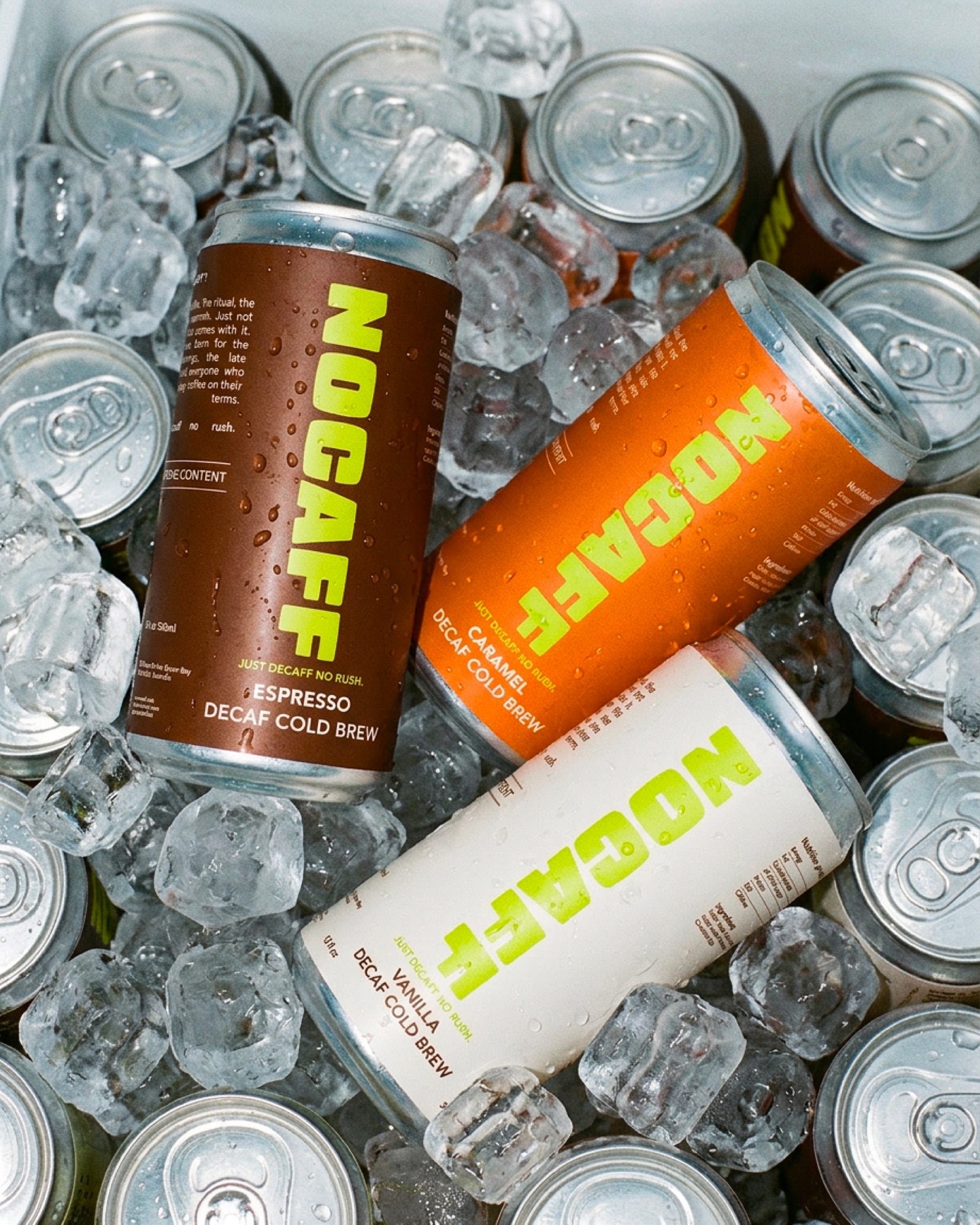
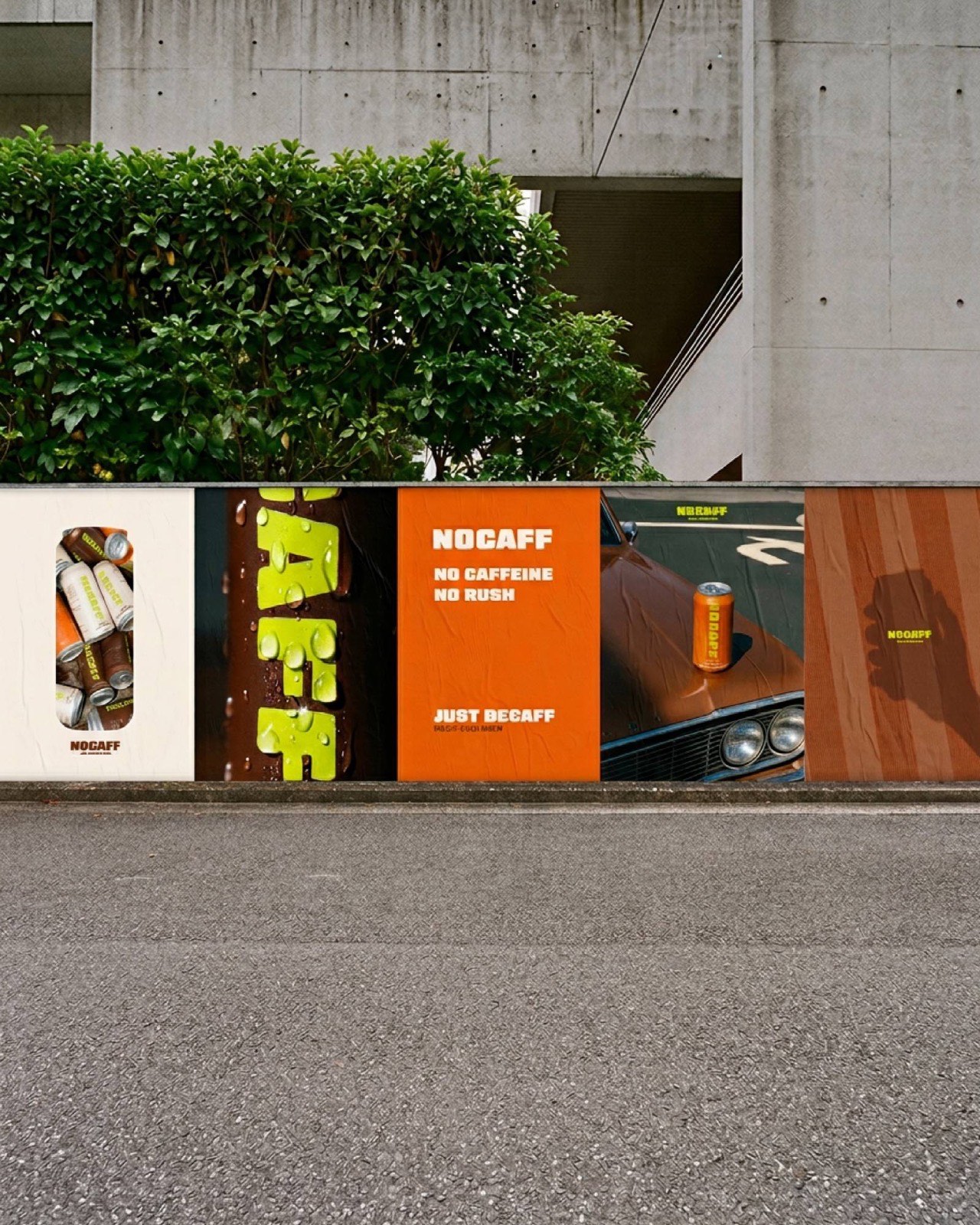
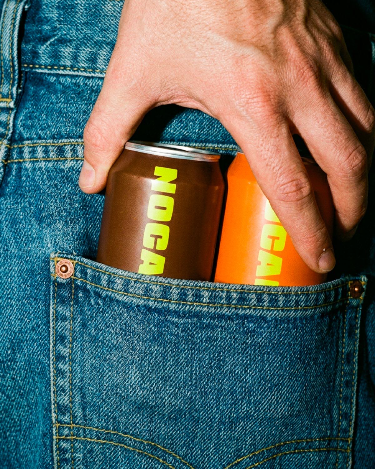
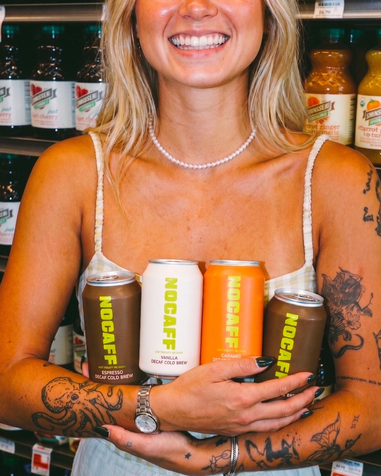
I built a modern, distinctive art direction and carried that world all the way onto the cans, for packaging as recognisable as it is desirable.
The art direction: playing with coffee’s codes
The identity plays with the codes of coffee in order to subvert them. Colour, type and composition give the cans a strong, contemporary presence while keeping the image premium and approachable.
The goal: decaf you also pick for its looks
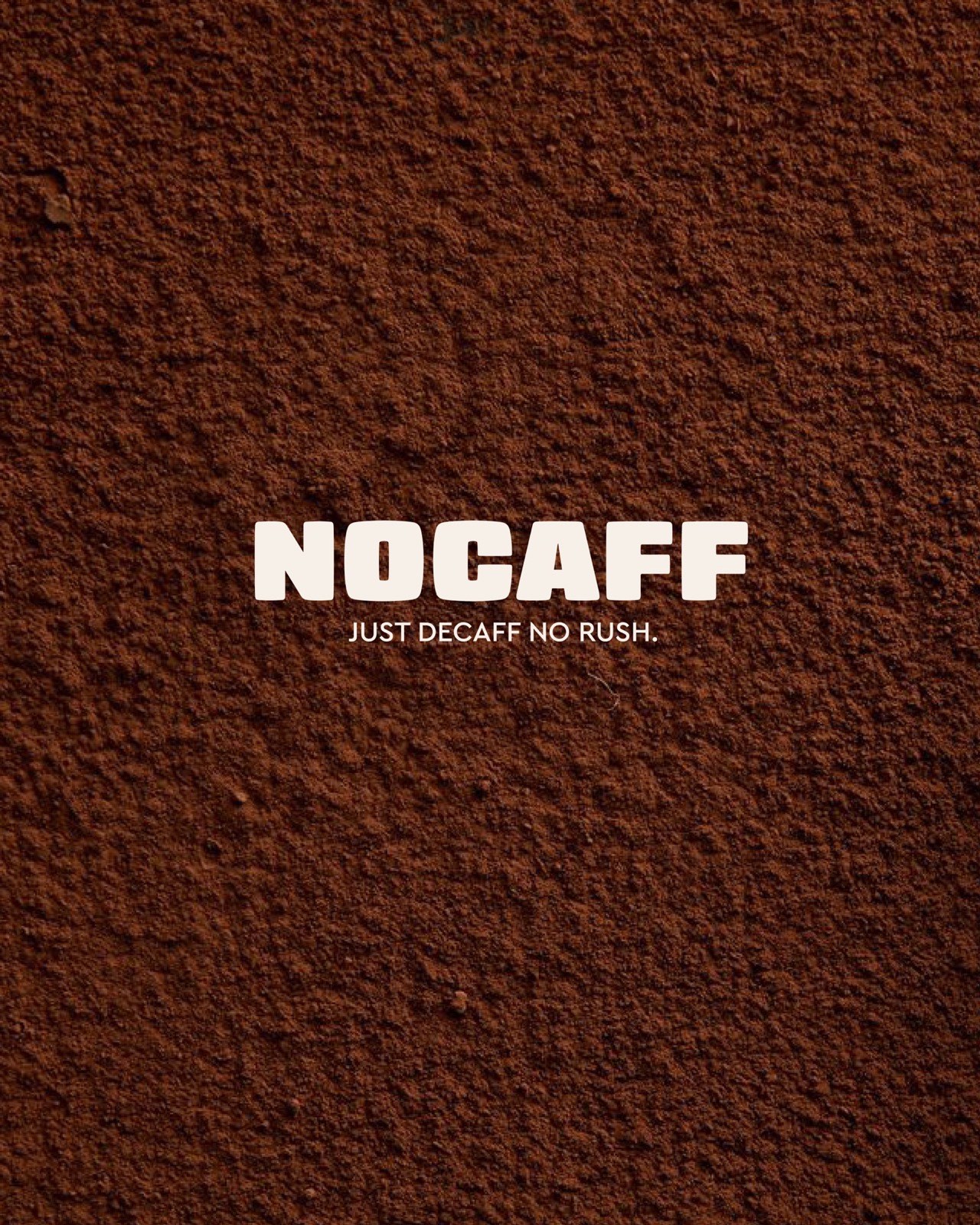
Making decaf something you choose as much for how it looks as for how it tastes. The line “Just decaff, no rush.” sets the tone: the pleasure of coffee, without the race.
The palette
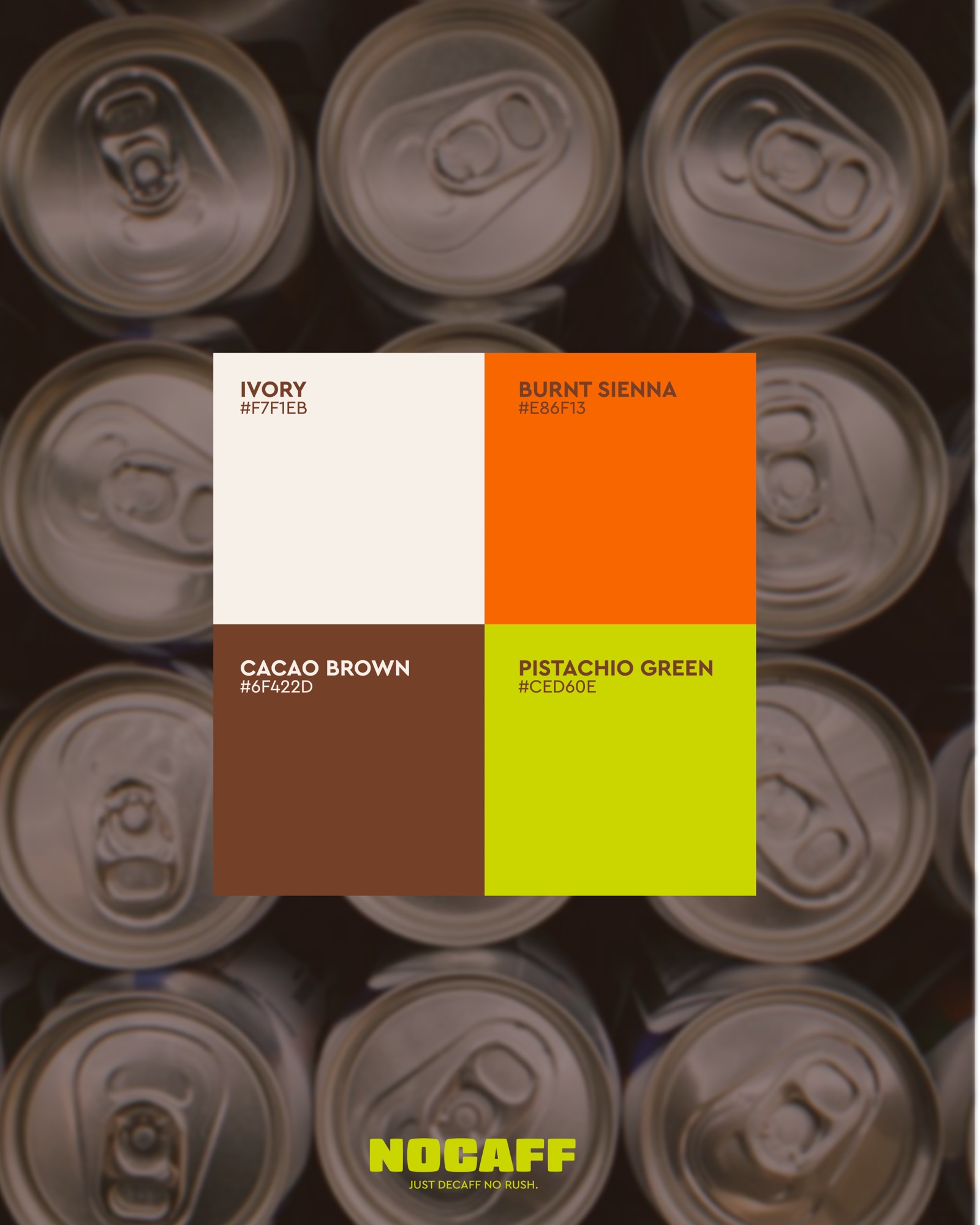
Four colours structure the whole range and tell each flavour apart:
- Ivory : #F7F1EB
- Burnt Sienna : #E86F13
- Cacao Brown : #6F422D
- Pistachio Green : #CED60E
Shall we start?
A project in the same spirit?
If this piece speaks to you, we can imagine yours, designed for your brand, not for someone else’s.