

Travel app
MemoBook
Identity redesign for a travel app
The project
- Client
- MemoBook
- Location
- France
- Year
- July 2026
- Scope
- Rebranding · Art direction
The project
MemoBook is a travel app that turns memories into a story. Using your voice, every moment of the trip is recorded and then transcribed to become a real book, waiting for you at the end of the adventure.
The challenge: a clear direction to guide the app
The brand needed a sharper direction to support the app’s development. So I rebuilt its visual world from the ground up.
The world: organic shapes and expressive type
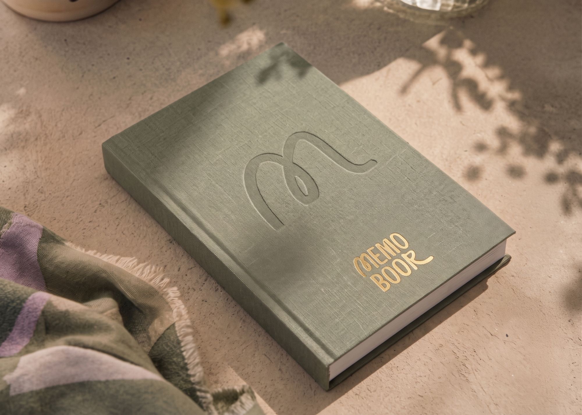
The identity rests on organic shapes, a livelier palette and expressive typography, to convey memory, movement and spontaneity.
The goal was to give MemoBook an identity strong enough to guide the app’s development, while keeping the personal, emotional quality of a travel journal.
The result
A complete world, ready to roll out in the app and on physical materials:
- New logo and the line “Le carnet qui s’écrit tout seul”
- A rethought, livelier colour palette
- An icon system designed for the digital experience
- Organic shapes and brand patterns
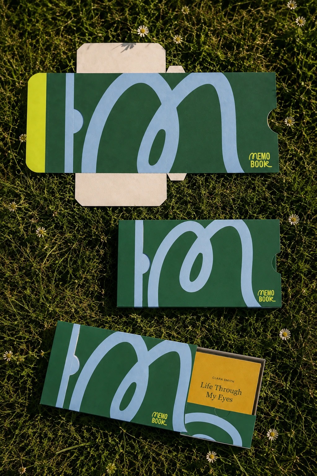
- Packaging and communication applications
Shall we start?
A project in the same spirit?
If this piece speaks to you, we can imagine yours, designed for your brand, not for someone else’s.